How to Create Your Auto Shop Logo for Free Using Canva
As an auto shop owner, are you able to say that your customers easily recognize you from the competition? Every small business needs a logo because it’s the foundation of your branding. You may be thinking you don’t have the time or money to invest in such an undertaking. But truth is, there’s no need to cut into an already tight budget hiring someone to design your auto shop logo for you because it’s a fairly quick and easy task that you can do yourself at no cost.
Here’s why you need a logo and how you can create your own auto shop logo for free using Canva.
Why You Need an Auto Shop Logo
If your auto shop had a face, then your logo would be it. It’s your most visible business asset and appears on everything from your website, business cards, and marketing materials. So, you definitely want to make a good first impression by leading with a great logo that sells your brand to prospective customers.
A logo is also your business’s personality and conveys who you are. Regardless of the business size and industry, you have got to differentiate yourself from the competition. A logo gives you identity and says, “this is who I am and this is what I represent.”
There’s no better way to showcase who you are than with a logo. You don’t want to be another faceless option in the auto repair industry, you can package yourself in a way that gets you noticed and communicates to customers.
Elements of a Logo (for Small Businesses)
Before getting started on the design of your logo, you should know that there are different elements of a logo. Some things you’ll want to consider before starting the design process are:
Logo Style
You must first figure out what type of logo style most fits your brand. Would you say that you have a vintage feel, or are you more modern? How about cool, classic, or a minimalist approach?
Knowing the style that you’re going for will help you decide on the other elements of your logo design.
Logo Type
Next, consider the type of logo that you want. There are five main categories to choose from:
Symbol: A logo that uses just one single symbol or icon
Wordmark: A logo where the text is only used to spell out the brand’s name
Lettermark: A logo that uses text, like a brand’s initials or the first letter of the brand’s name to create a symbol or icon. (Picture the Volkswagen Logo).
Combination Mark: This is a logo that uses both the symbol and wordmark type logo.
Emblem: A logo design that resembles a seal or crust featuring the company name within the design. (Think about the logo for Harley-Davidson or BMW.)
Color Palette
When thinking about colors, it is a good rule of thumb to stick to three colors or less. There is limited space on your logo so less is more when it comes to incorporating color into your logo.
You also want to be strategic when it comes to choosing colors. People tend to have strong associations with colors and you can use those to your advantage. As Alina Wheeler said in DESIGNING BRAND IDENTITY, “Color is used to evoke emotion and express personality.” For instance, blue and green are associated with trustworthiness, purple with royalty, and black with sophistication.
The book also quotes Sean Adams in saying, “Color is subjective and emotional.” So, does red mean stop or does it mean Coca Cola or Five Guys or KFC or Netflix or Target? Is red fire or fall leaves?
If you studied Color Theory, you’d learn all about complementary colors and how to put them together in a color scheme. But were going to save you lots of time by pointing you to the Canva color palette generator or this tool here and have a color palette created for you.
Graphics
If you want to incorporate a symbol or company mascot into your logo, then you may want to consider graphics. Whether you do this or not, you want to think about how to incorporate graphics first before you begin to add other elements.
Keep in mind, that logos will often be as small as an icon on a phone, so complicated details can be lost when the logo is very tiny.
Typography
If you’re going to have any type of text in your logo, then you need to consider the font type or typography.
The four main types of fonts are:
Serif: A popular example of this is Times New Roman, where there’s an anchor at the end of each letter and are more traditional.
Sans Serif: These fonts do not have anchors on each letter and have more of a smooth appearance and a more modern feel.
Script: This font looks like cursive handwriting.
Display: These fonts can vary but are defined by a unique characteristic or effect.
The current trend is toward simplified typography. Take a look at Google’s logo evolution below. Not only is the new design simpler and flatter (no shading in the colors), but it can be broken down to just the ‘G’:


How to Define Your Logo
The first step to designing your logo is not the actual design process. Your logo design is important and your goal is to get noticed and stand out from the competition, but how do you do that?
Do Your Research
Research your industry and explore what other brands are doing. Exploring other brands will help you identify trends and ways you can set yourself apart. Keep track of what you like and what you don’t. Note the colors that are used, the goal is to stand out or emulate. Write down what emotions you feel when looking at their logos (try to ignore the negative emotions about a competitor!)
Look for Inspiration Around You
Keep your eyes open and you can find things you like in unexpected places. Like typography on a billboard or color combinations in nature.
Speaking of Google, just do a search for Logo and click on images. You can (and should) spend tons of time looking at all the options out there.
Determine your Point of Difference
Establish your point of difference (POD) and what makes you special and unique. If you’re not sure what your POD is, some questions to ask yourself are:
- What do you do better than anyone else in the market?
- What’s your biggest strength?
- What’s the best compliment you’ve ever received from a customer?
- If you could describe your brand in three words what would they be?
What is Canva?
Canva is a graphic design platform that allows you to create different types of visual content. It uses a drag and drop concept and is quick and easy to use. It can save you, as a business owner, a lot of time by turning a once time-consuming project into a task that can take minutes.
Using Canva to Create Your Logo
Of course, you want to first create a free Canva account.
Now that you’re in and have an idea of what you’d like your logo to look like, you can start designing.
Follow these steps for designing your logo in Canva:
Step 1. Browse Layouts
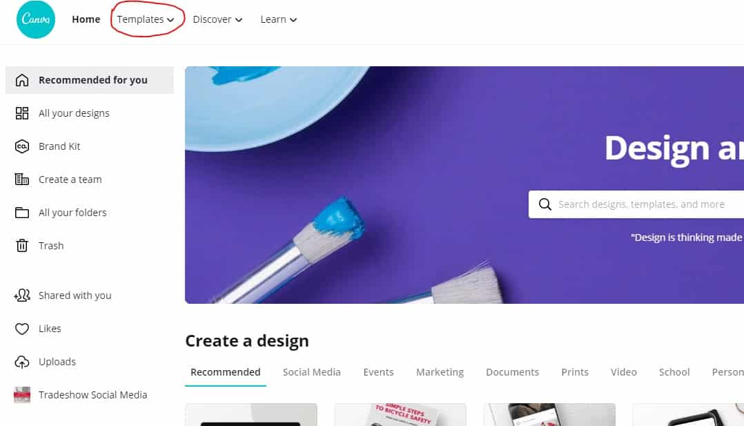
You can find logo templates by clicking on “Templates” in the top left corner of the page. Then, type ‘Automotive Logos’ in the discover templates search bar. Press enter and take a look at your options.
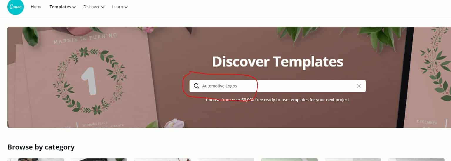
If you see an existing design you like, you can customize the layout by changing the fonts, images, and colors.
If you don’t see anything that feels right, continue with the next steps to build your logo from scratch.
Step 2. Choose your Colors
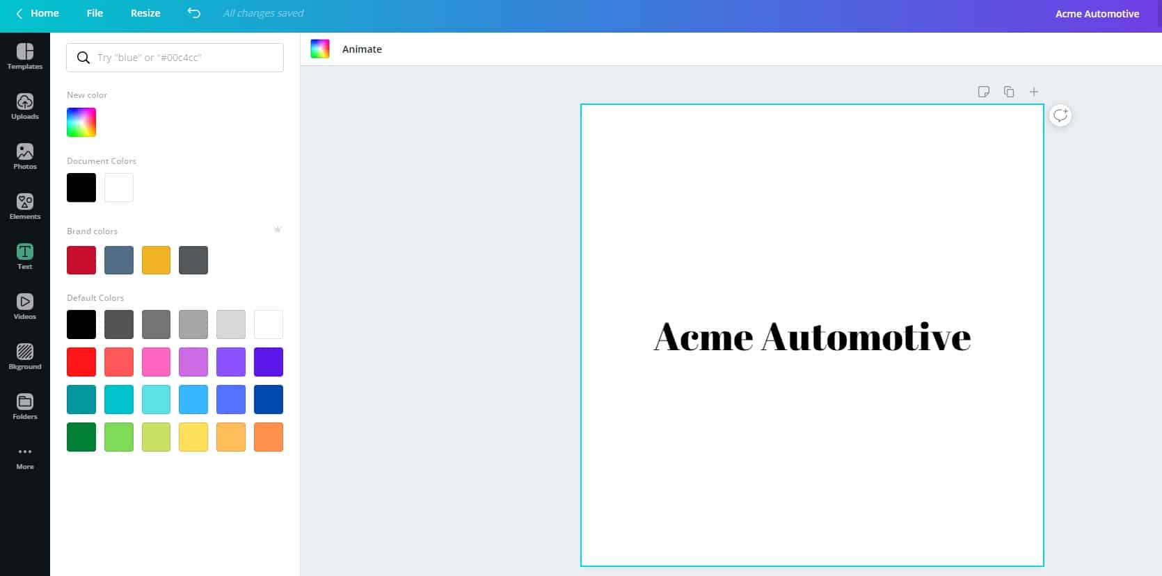
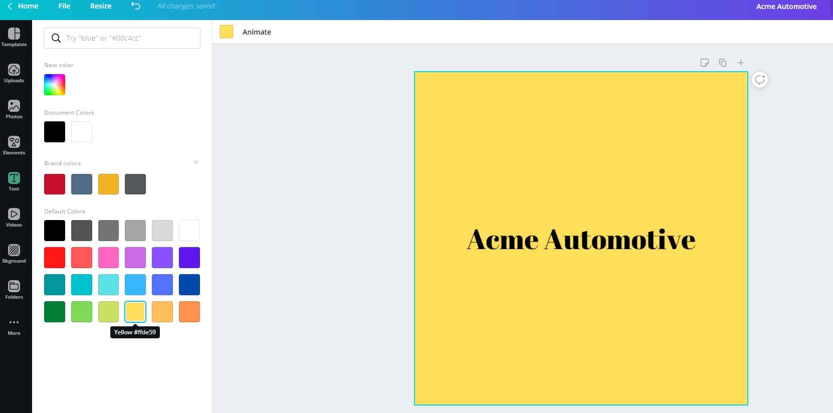
Assuming that you’ve already chosen your color combinations with the tools we mentioned in the Color Palette section, you can click any part of your design to bring up the options menu and locate the icon for colors. You can add the hex code(ex. #F0000) from the colors you’ve chosen, select from the default color palette, or create your own if you’re still undecided.
Step 3. Choose Your Font
Once you’ve got your colors in place you can now focus on the text if applicable.
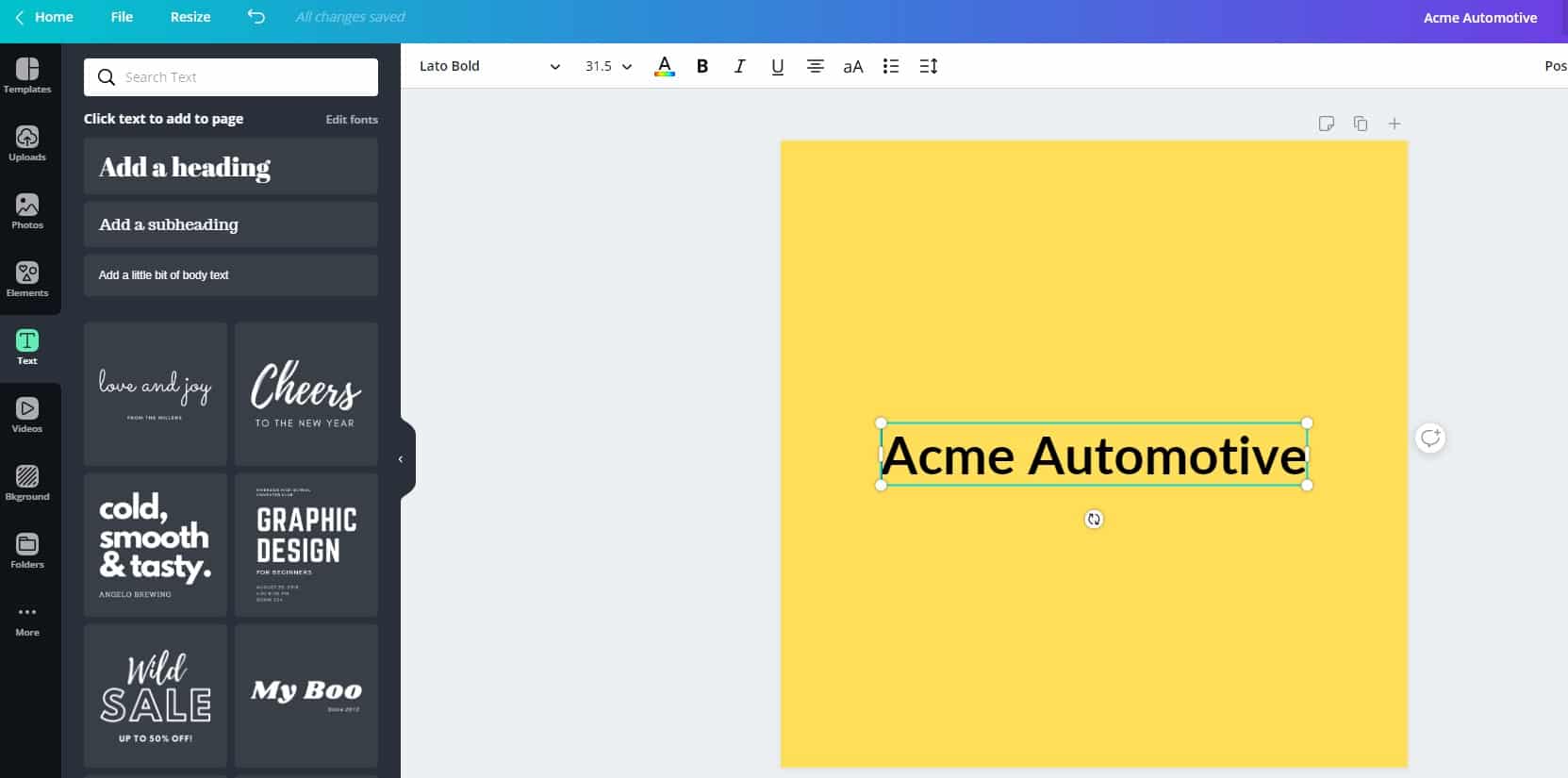
You have two options with text. You can add it manually by using the “add heading”, “add subheading”, and/or “add a little bit of text” features. Or you can browse the font layouts and choose one to customize. Both of these options are located in the left sidebar.
If you choose to add text manually, first add the text using one of the “add” features. Once you’ve added the text, you can change the font, size, color, and style using the menu options above your design.
Step 4. Add Additional Style Elements
Once you’re finished with text, you can add other elements. Lines, shapes, icons, or whatever else you want to add to give it that extra touch can be found on the left sidebar.
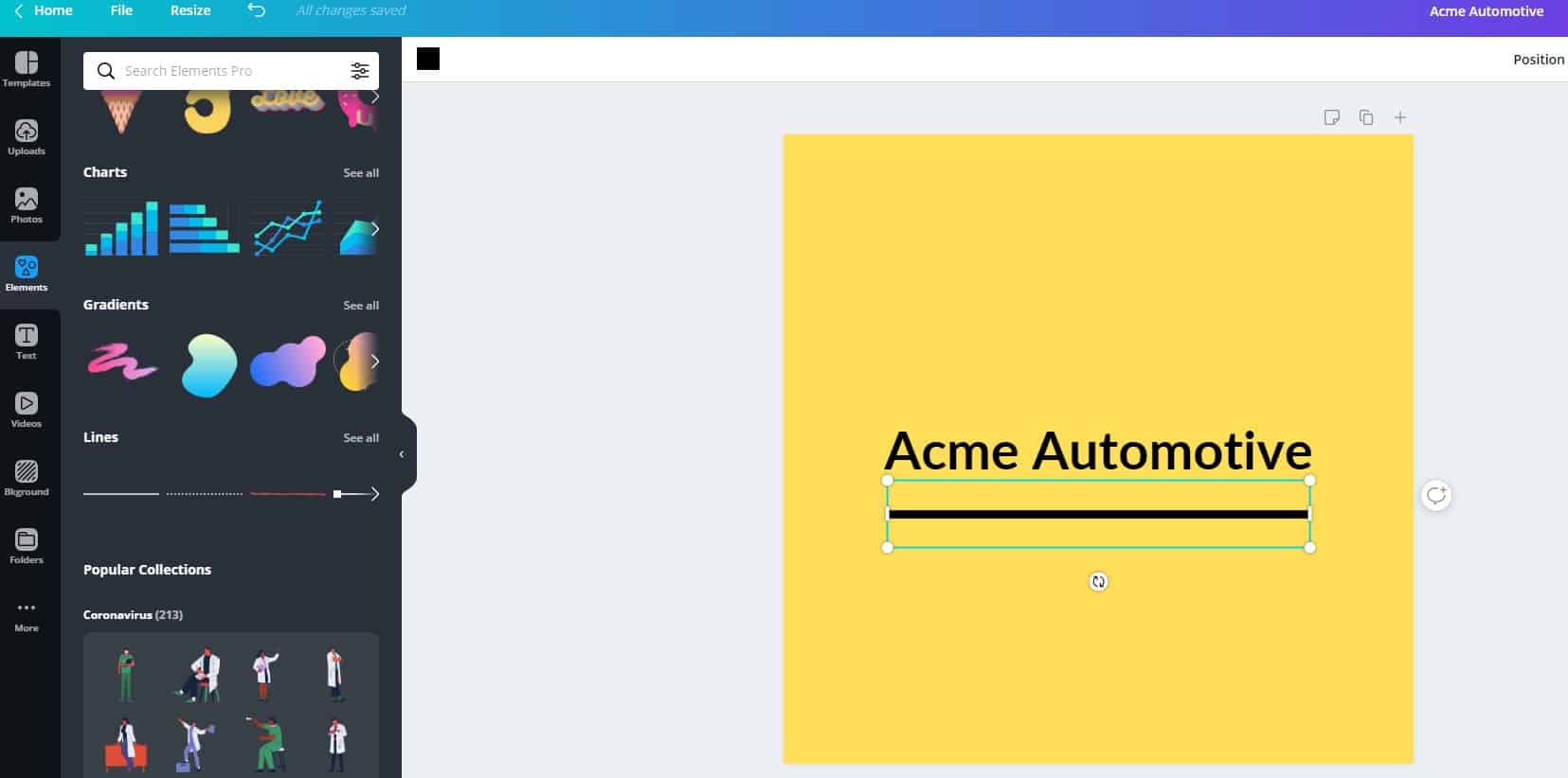
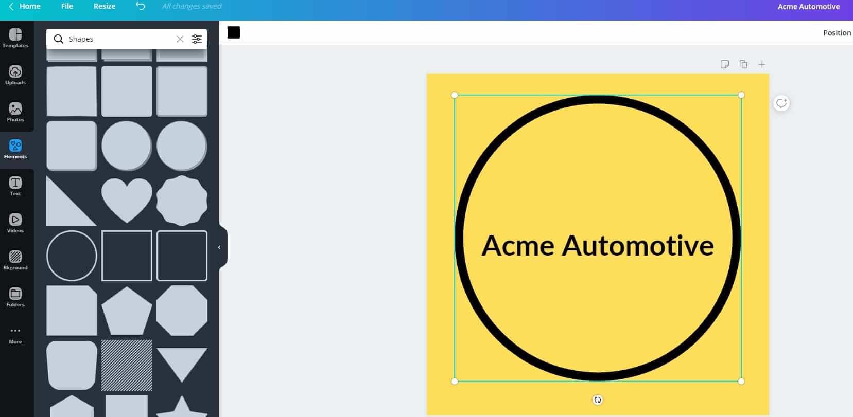
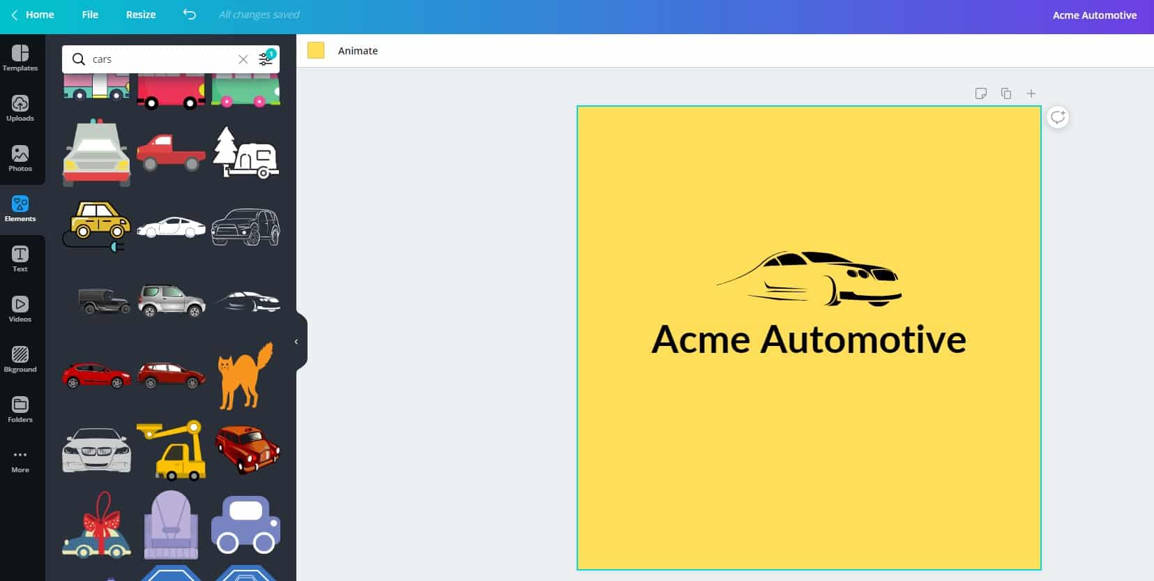
You can change the color of any of these style elements by clicking the color square in the top left menu bar.
Step 5. Finish and Save
Once you’ve changed this, tweaked that and finally feel good about your work, save a copy of your logo by clicking on the “Download” button located at the top right side of the page. Your logo is now good to go!
Step 6. Use Everywhere and Be Consistent
Your logo is a part of your brand. To make that connection, make sure everything from your letterhead to your website to your business card uses the same logo.
When you need to add color to something, make it one of the colors from your logo. Change your PowerPoint colors and add them to your brochure. Not having consistency is one of the primary ways branding can fail.
Show Off Your New Logo
Your auto shop logo is a representation of your business and is a critical tool in the promotion of your brand. You most certainly have other matters to tend to but don’t overlook the importance of investing in a good logo.
Although it takes some time and effort to take your business identity and turn it into something visual, the actual design process can be quick, easy, and best of all, FREE!
Now that your auto shop has a new logo, you’ll definitely want people to see it.
Click here for local advertising ideas to get new business for your auto shop and be seen in your community.


